

Your marketing, made easy.
The Ask.
Shopify had spent years operating without a formal style guide. While this preserved creative flexibility, it also led to brand inconsistency—especially on Shopify.com, where freelancers maintained much of the site without a shared system for decision-making.
I was tasked with two things:
Refresh the Marketing page—one of the brand’s highest-traffic entry points.
Create a repeatable framework other content designers could use across the dotcom experience.
The Challenge.
How do you create a style guide for a company that historically rejected them?
And how do you do it one month into the job?
The Insight.
Instead of introducing a traditional, top-down rulebook, I built a dotcom-specific blueprint grounded in how the brand already spoke, and why.
Through conversations with design directors, product marketers, and fellow writers, I distilled an actionable set of principles tailored to Shopify.com. Not abstract guidelines, but clear “do this, not that” decisions tied to business goals.
One directive from the CMO became the anchor:
Be brutalist, but don’t be boring.
That meant stripping away excess language and stating the most exciting truth about the product as directly as possible.
My Solution.
Clarity wasn’t just a stylistic choice—it became the system.
I codified these principles into a one-page working guide that explained:
What dotcom copy should prioritize
How it should differ from other surfaces
Why those differences mattered
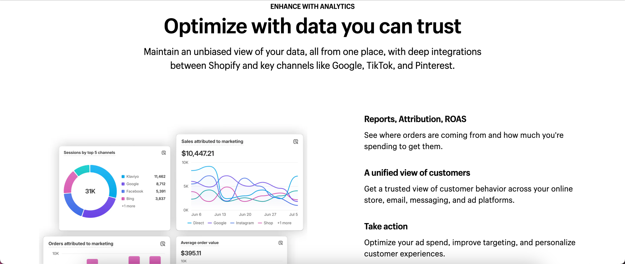
Then I applied the framework directly to the Marketing page, transforming it from a collection of messages into a cohesive narrative built line by line around bold, benefit-forward clarity.
The page became both proof of concept and template.
My Impact.
Established the first dotcom-specific content blueprint
Enabled distributed freelancers to make consistent brand decisions independently
Increased web traffic to the Marketing page
More importantly, it shifted the team’s mindset: we were no longer writing page by page—we were building a system.